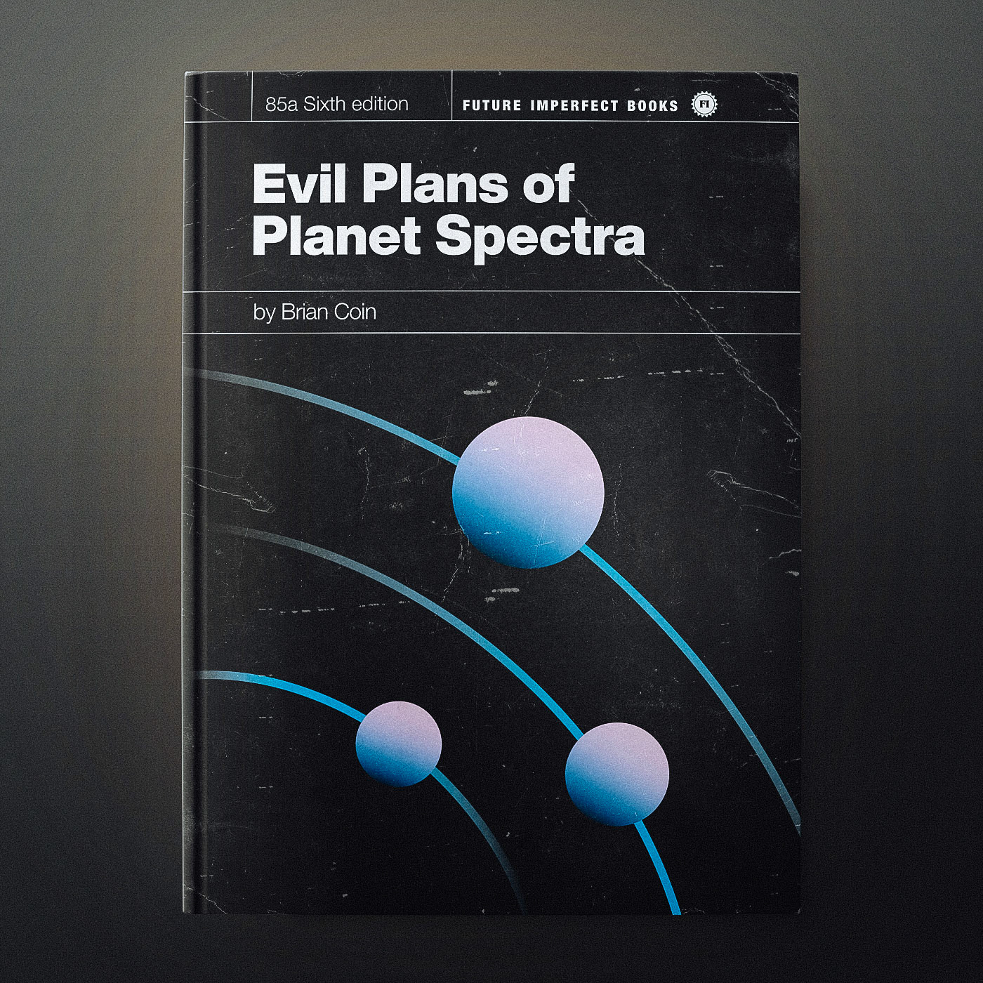
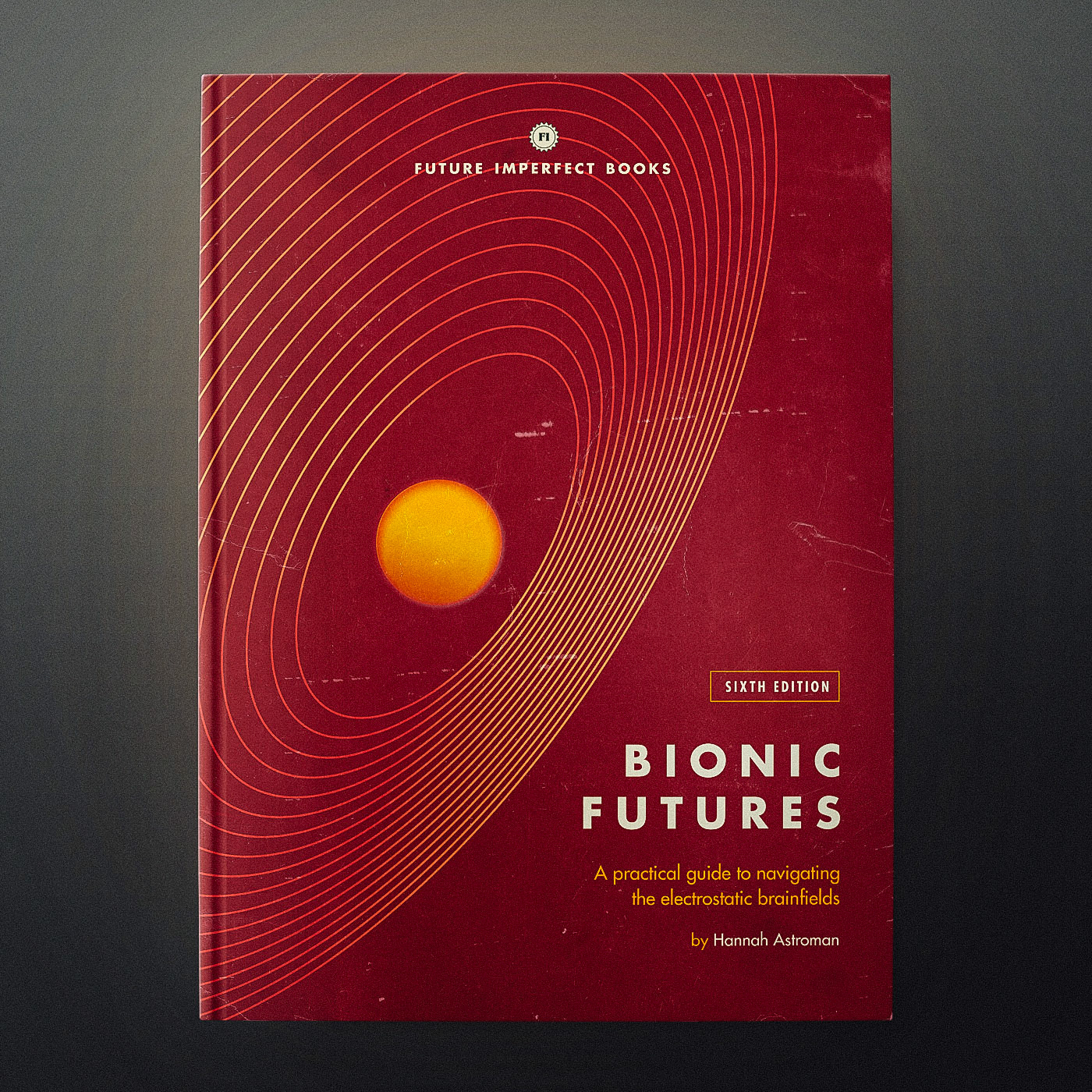
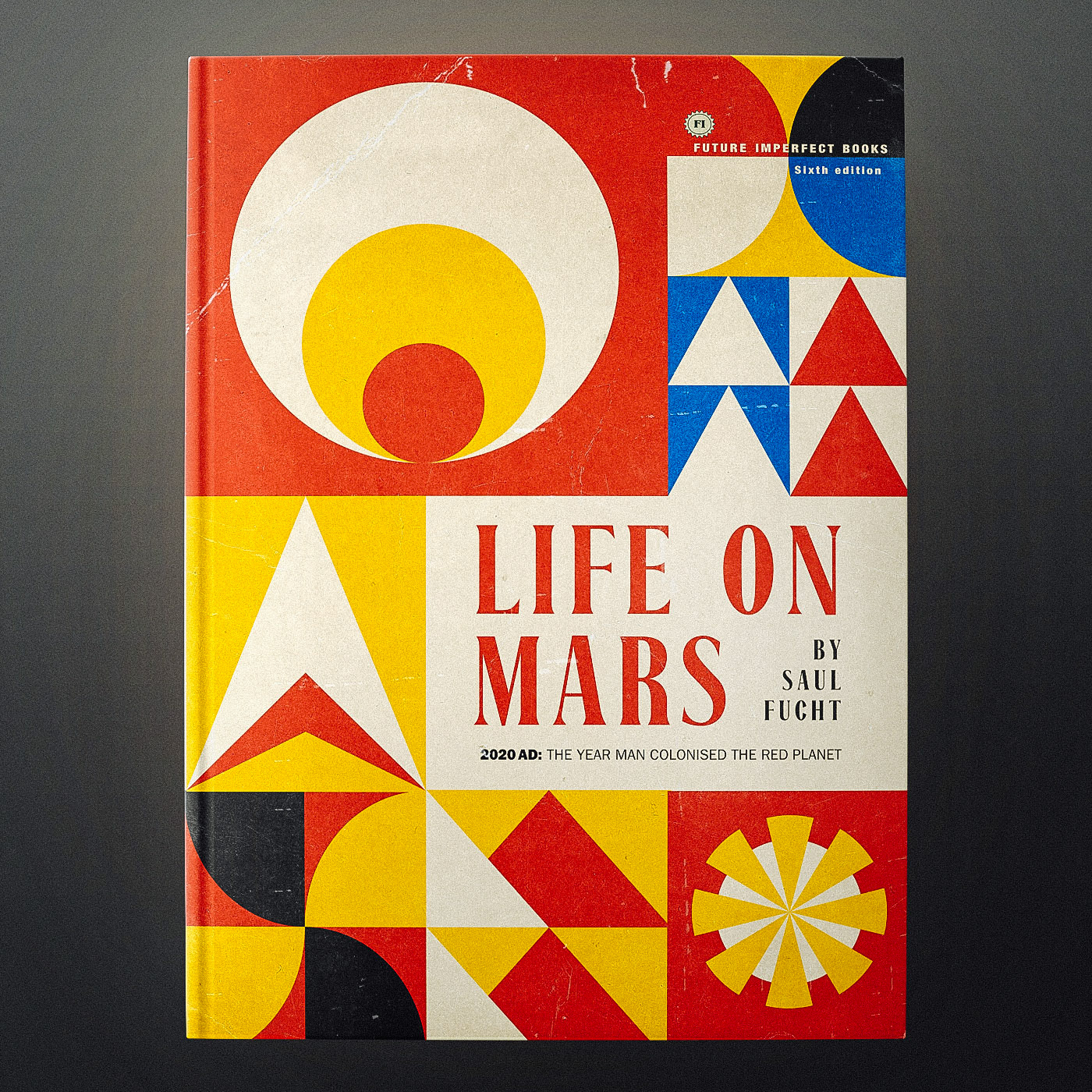
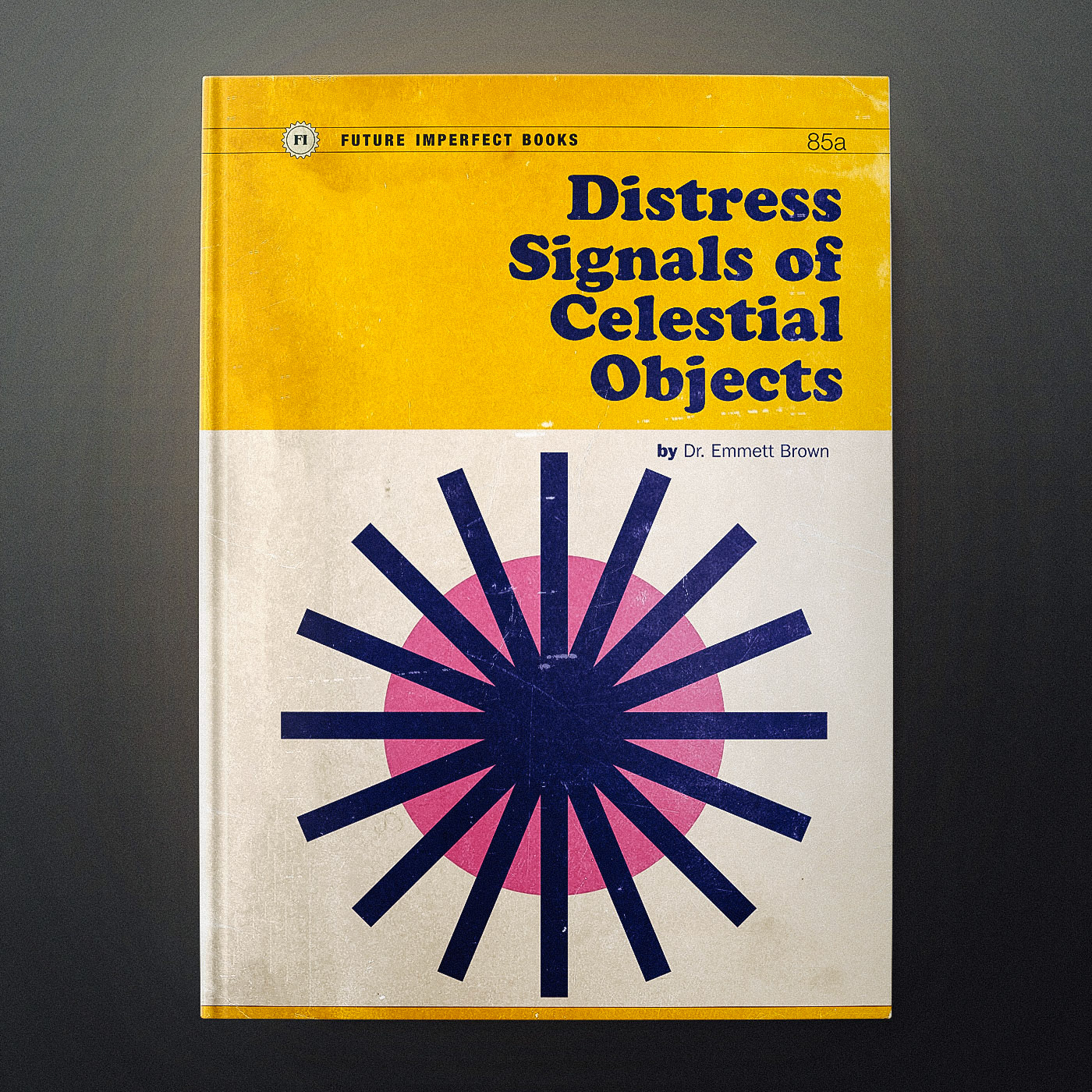
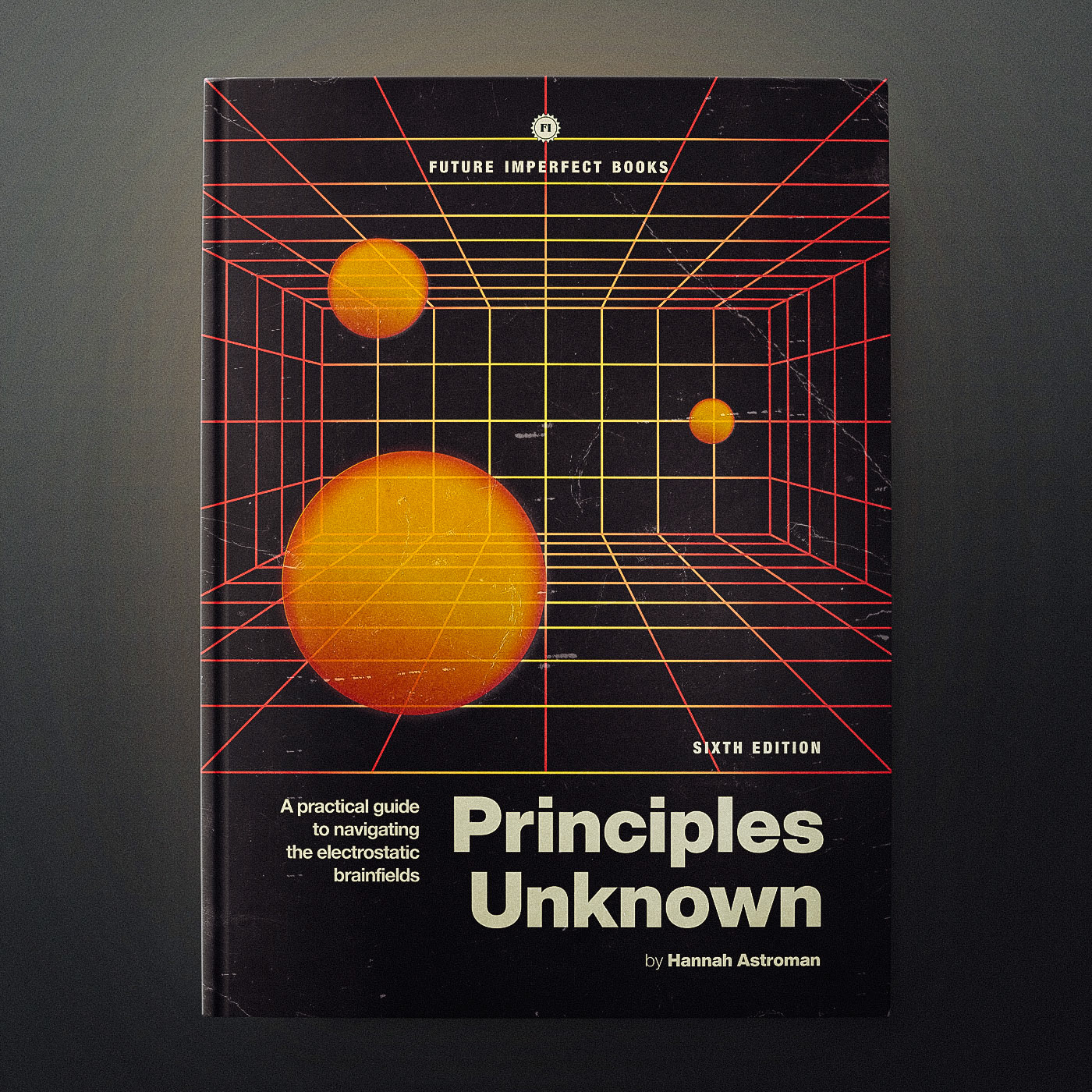
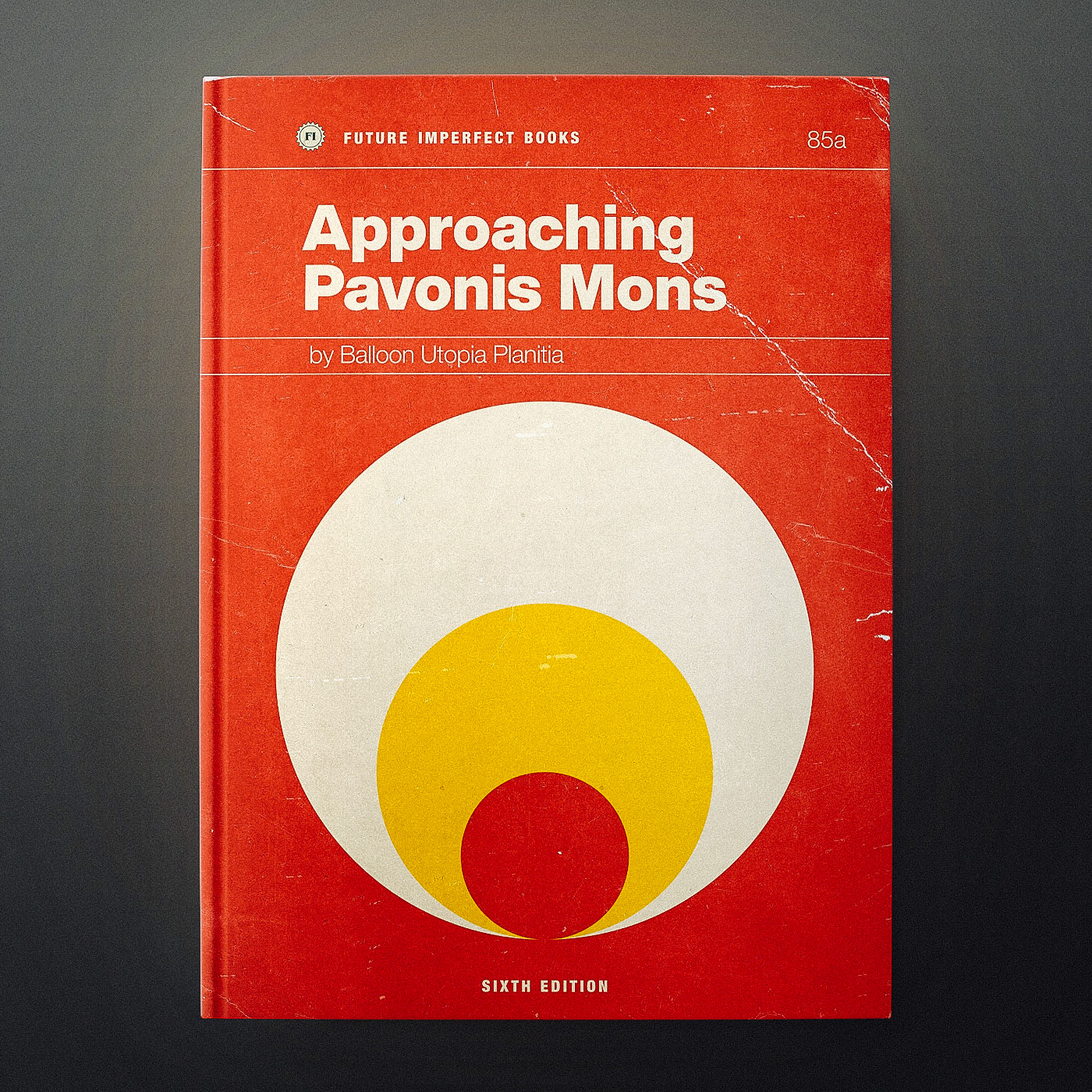
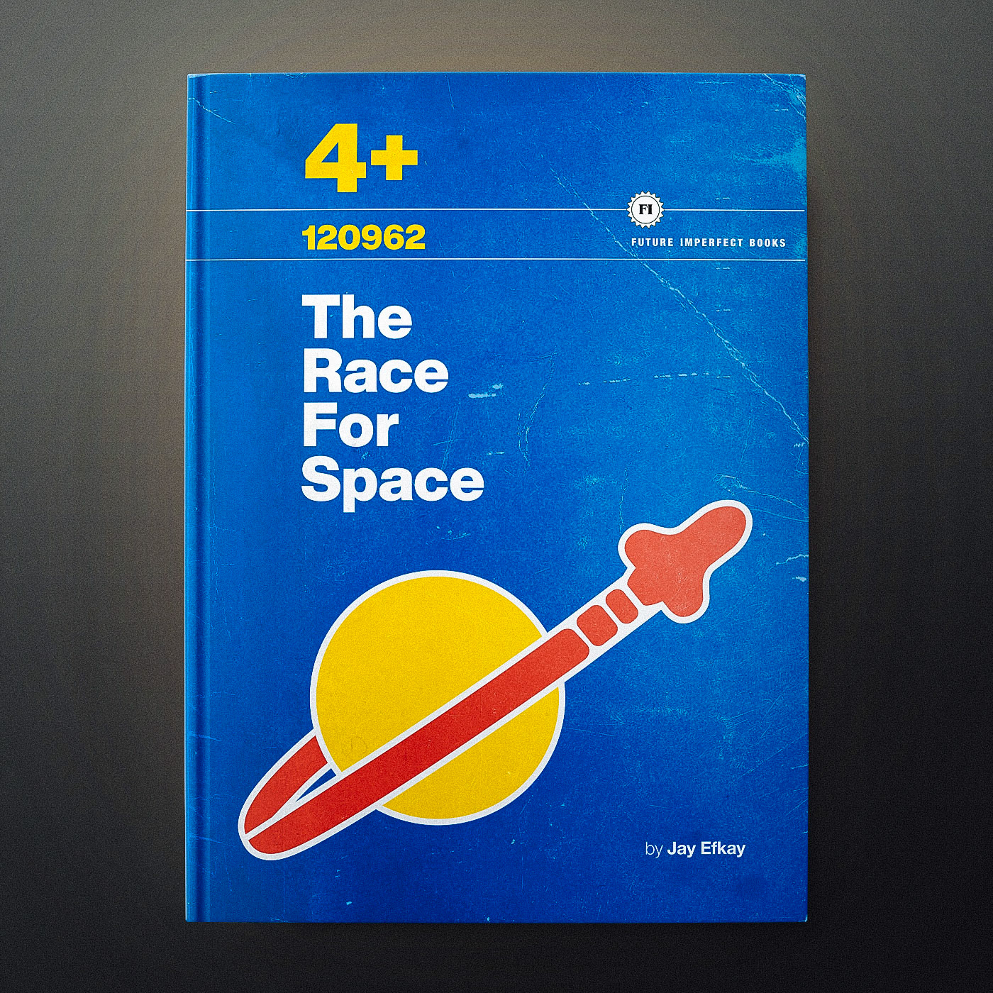
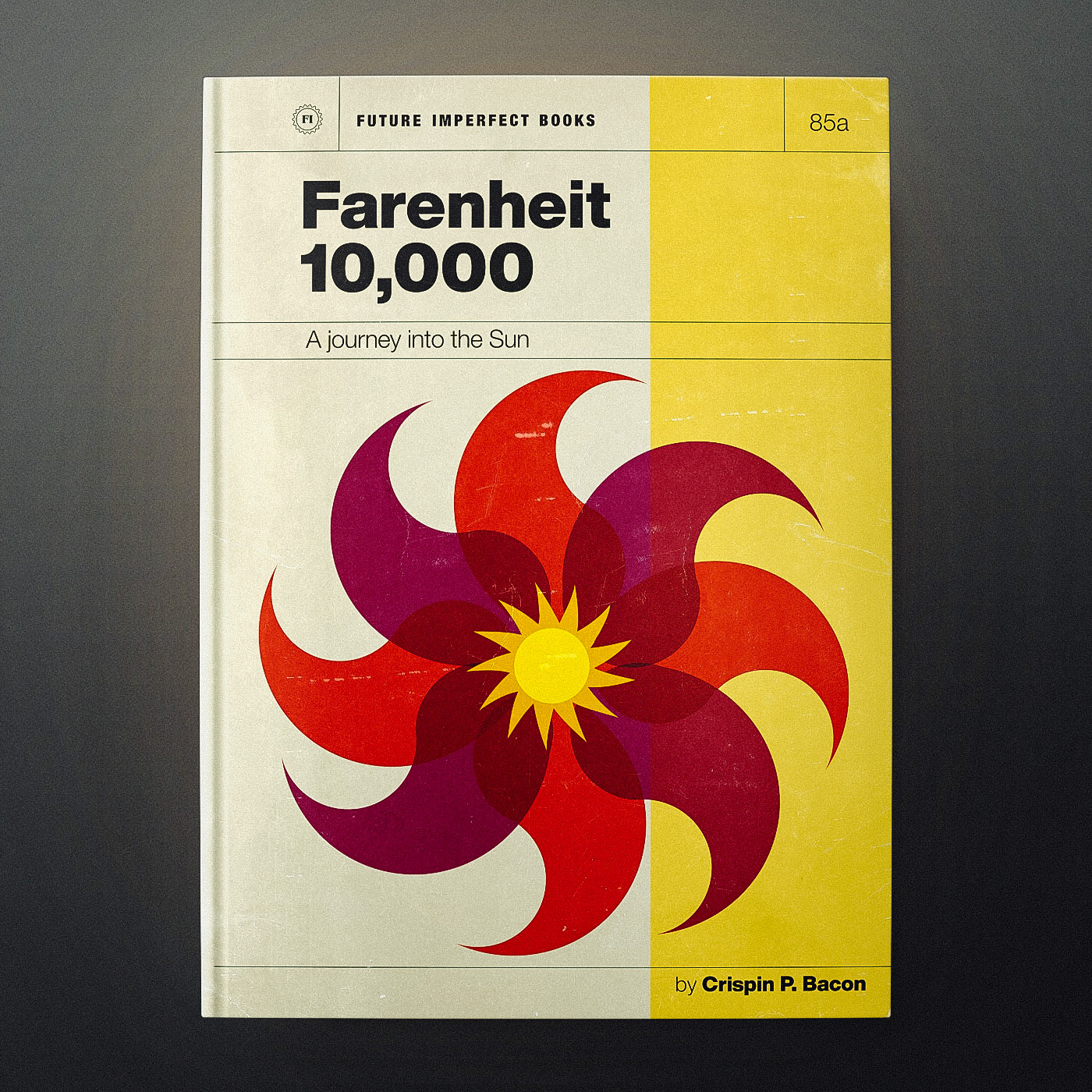
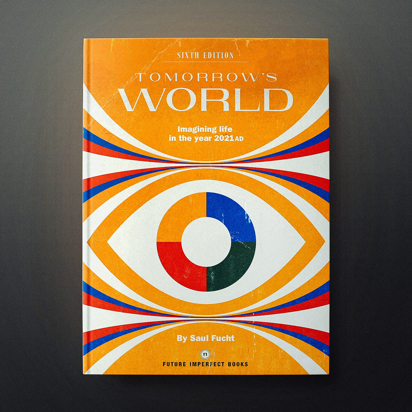
Remember how the future used to look?
Maybe I watched too much Tomorrow's World as a kid...
... but I've always had this thing about the way the future was supposed to look.
So I thought I'd pop on a silver jumpsuit and try my hand at some minimal geometric retro-futurism.
This idea began during lockdown: by the year 2020 shouldn’t we be living in colonies on Mars not stuck inside our homes?
(And I had to name-check Tomorrow's World)
Some of the 'Future Imperfect' designs came out like textbooks and some felt like forgotten sci-fi novels.
The titles are often borrowed from lyrics by The Flaming Lips and Man Or Astroman.
I also wanted them to look like time had taken a bit of a toll on them.
I even borrowed what, I think, is the most iconic of all the retro-futuristic logos...
So even if that future of flying cars and silver jumpsuits never materialised...
... I still think it used to look pretty cool.

